Riverbend Church Logo
In the Spring of 2016, I was hired by Riverbend Church in Hernando, MS. to design a logo. The church was founded in the Lake Cormorant area and due to the area geography, the name Riverbend was chosen. The decision was made to keep the name based on the familiarity it has for its members and the community.
The process for this design was more involved than usual for a logo. First there was the difficult challenge of coming up with an idea for a Christian symbol. So many good ideas are already taken and there are ten times more cliche ideas that one would probably want to avoid. Secondly, the church bases its beliefs summary on Isaiah 35:1-10. In other words, this was the passage that Riverbend hangs its hat on as a body of believers.
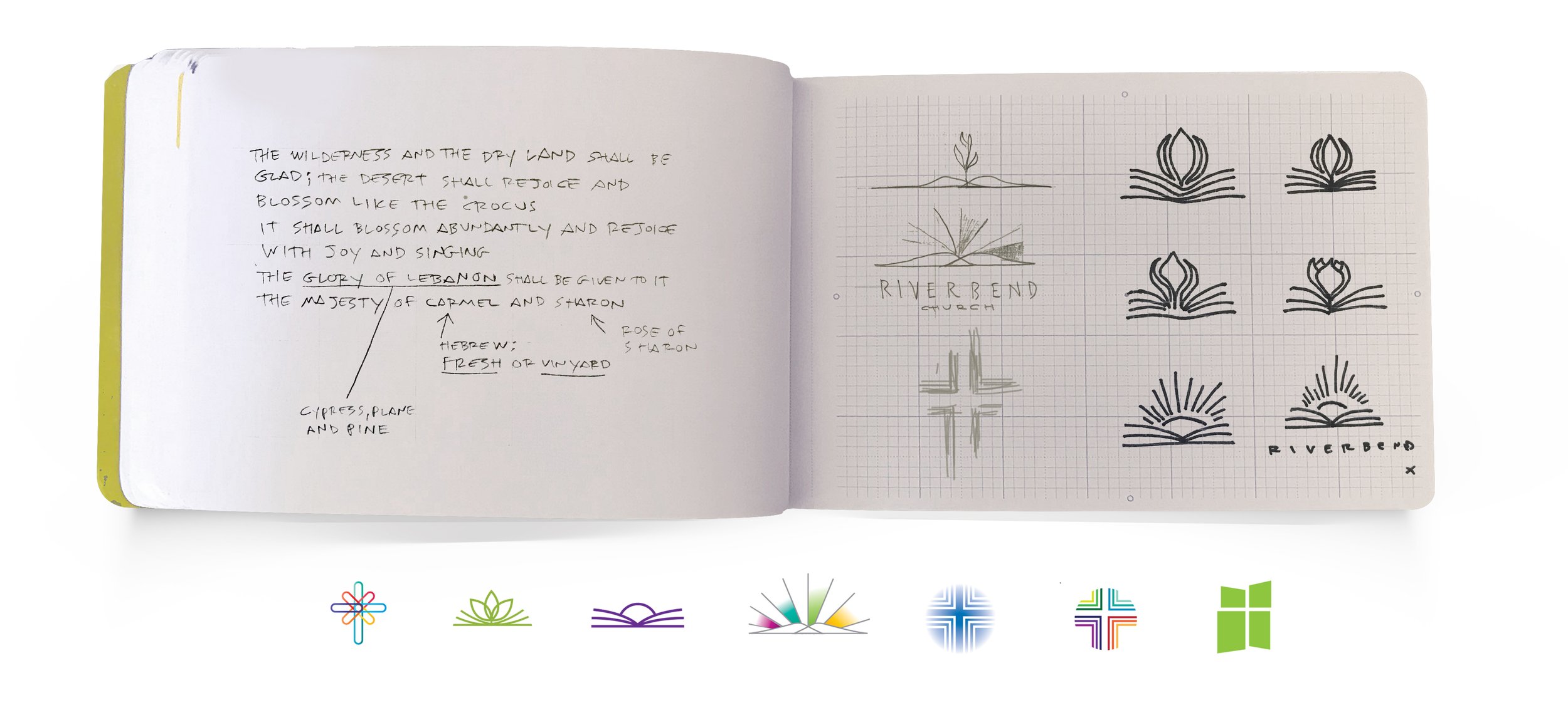
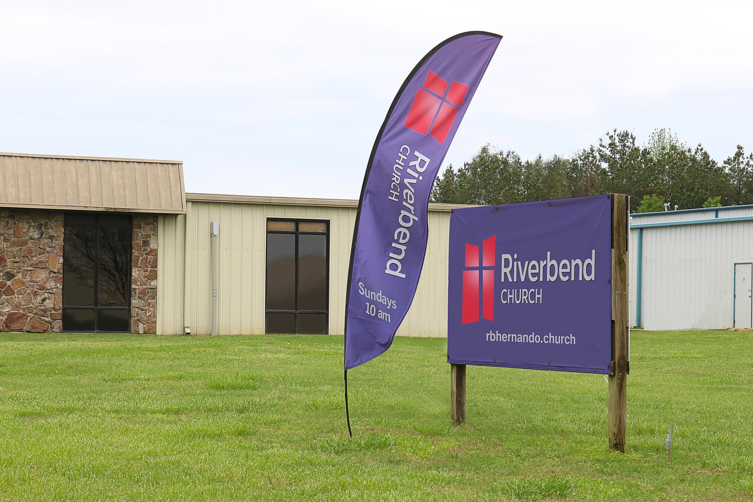
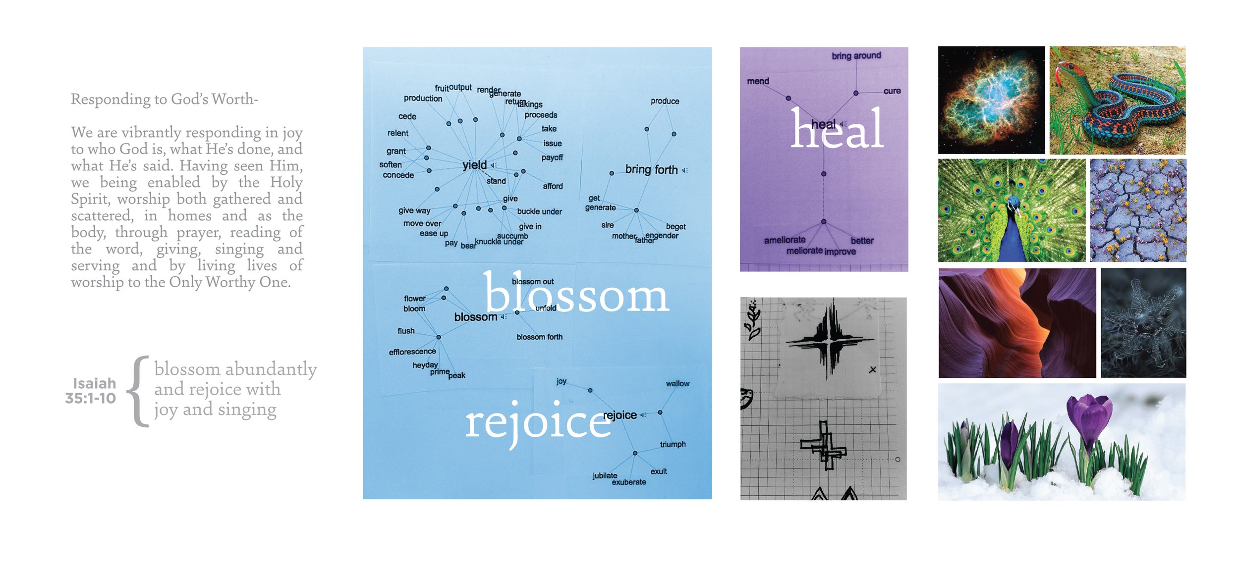
Working from word lists I found inspiration from both individual words and passages from the text. I did an image search online and created a mood board based on the things I found in Isaiah 35:1-10. It took a little while to do, but I think this was an important step to put these words and images into a meaningful order, a design before the design if you will. Once I began sketching, I found some interesting correlations from flowers blooming in harsh environments, bursts of light and radiance and the idea of growth. Some of these suggested an open Bible with a flower rising out of it, or a sunrise, while other ideas were simple shapes making a cross. The cross was the direction Riverbend wanted to pursue and I then explored different versions, color variations and font styles. The chosen concept doesn’t require a lot of explanation, its a window with four irregular frames that make up a cross. It strikes a good balance for a symbol that isn’t too familiar, yet clearly makes a cross. In the end, the cross is the best thing it could point to.


