
Graphic Design Early Inspiration: 1960s Speed Shop / Hot Rod Typography
When I was a kid , I vividly remember the times I went into local auto parts stores and mechanics shops with my dad. He would be in there buying parts or motor oil and I would come along, taking in the sights and smells of these places. They would smell like dust and oil and cigarette smoke. The counters would be oily, yellowed and worn looking from all the customers leaning over to get a part pulled and talk to the clerks behind the counter. Parts cabinets and pegged displays holding tools, parts and cans of motor oil, Armor All, and STP Gas Treatment.

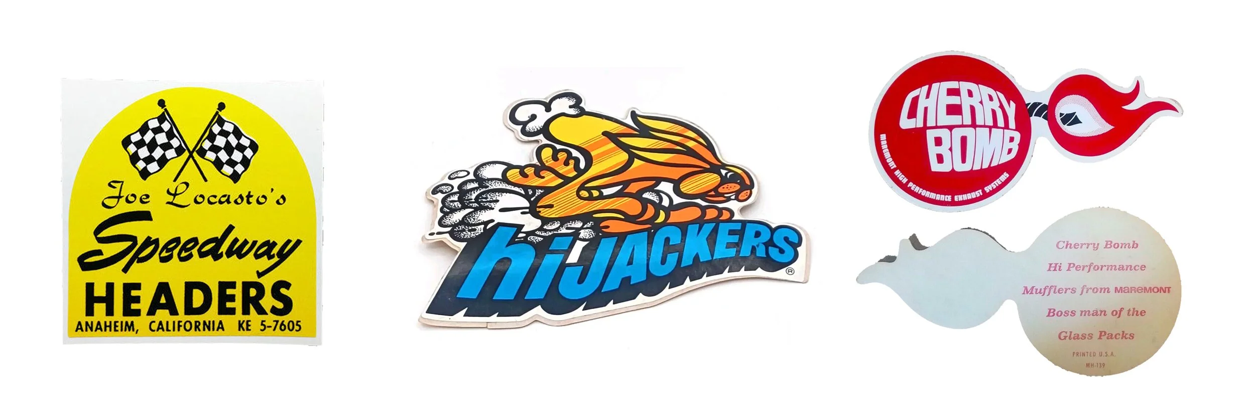
NAPA, Miller Auto Parts, Howell Auto Parts, all parts stores owned by local people, well before corporate chains like Auto Zone and O-Reilly came in. But as a visual person, I was really drawn to all the signs, posters, hats, graphics and especially the stickers. It was the late 70s but there were still examples of these incredible designs everywhere, on windows, back windows of vehicles, toolboxes, and they were glorious. The designs varied, but the thread that ran through most all of them was a human, hand made, individualistic and uniquely American aesthetic.
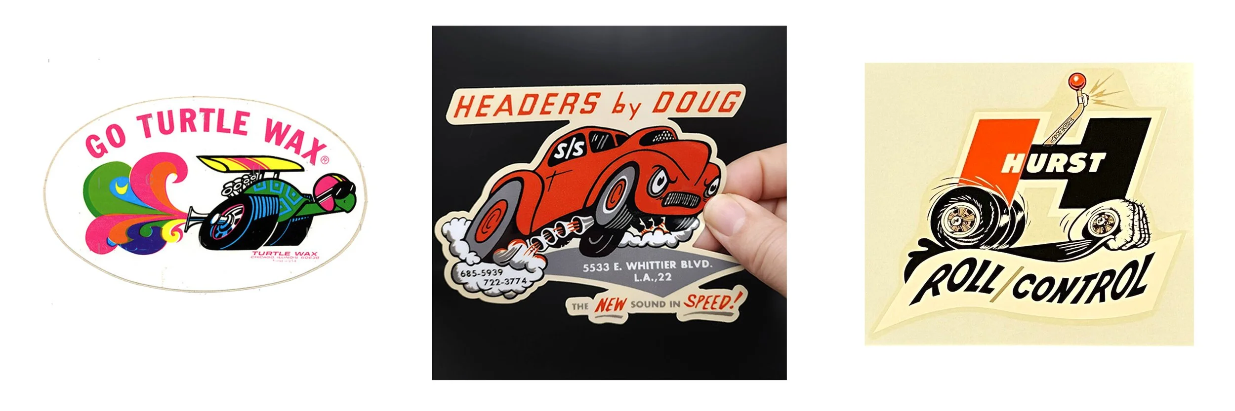
There were slicker, more ‘corporate’ designs by NAPA, Monroe and Car Manufacturers like Dodge and Ford, mostly typographic and heavy on the Futura and Trade Gothic. There are also some pretty wild mod, hippie, psychedelic designs and especially lettering that look like they would be completely at home on a Fillmore concert poster. Look at the GO TURTLE WAX sticker, this guy is just awesome with his racing goggles, drag racing slicks and some groovy exhaust fumes. Just perfect. Headers by Doug perfectly captures the vibe of 1960s West Coast independent speed shop, the modern shapes, the exaggerated illustrative style and the type, cool Gothic fonts and of course Futura, paired with hand lettered NEW and SPEED!
Hurst shifters almost has a category of its own. This is the company that made manual transmission floor shifters and knobs with the gear positions R 1 2 3 4. Aside from the gas pedal, these knobs would be the source of all the car’s power and a direct connection with the driver. The stickers really go all out to show the coolness of these small accessories. Look at the Hurst Roll / Control sticker. It shows a monster hand wrapped around the wheel aggressively grabbing the pavement. It echoes the work of Ed Big Daddy Roth, but skillfully merges the illustration of the hand with the H monogram. The warped lettering for Roll / Control reminds me of the work of Reid Miles for Blue Note records.
This world barely exists in the mainstream anymore, the parts shops, cars and advertising has all moved on. But perhaps what we can take from this era is extent that these commercial and layman designers had fun with the subject matter. They had an incredible sandbox to play in when muscle cars were made of steel and every engine ran on gasoline. I’ll always look at these examples and smile at the mod graphics and crazy lettering and remember my dad working on his Chevrolet C/K Series pickup in the driveway.